MEDIAS SCROLL-SNAP
CAROUSEL
LABEL GOES HERE
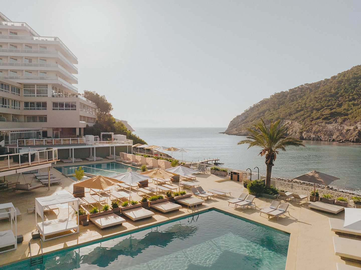
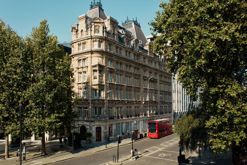
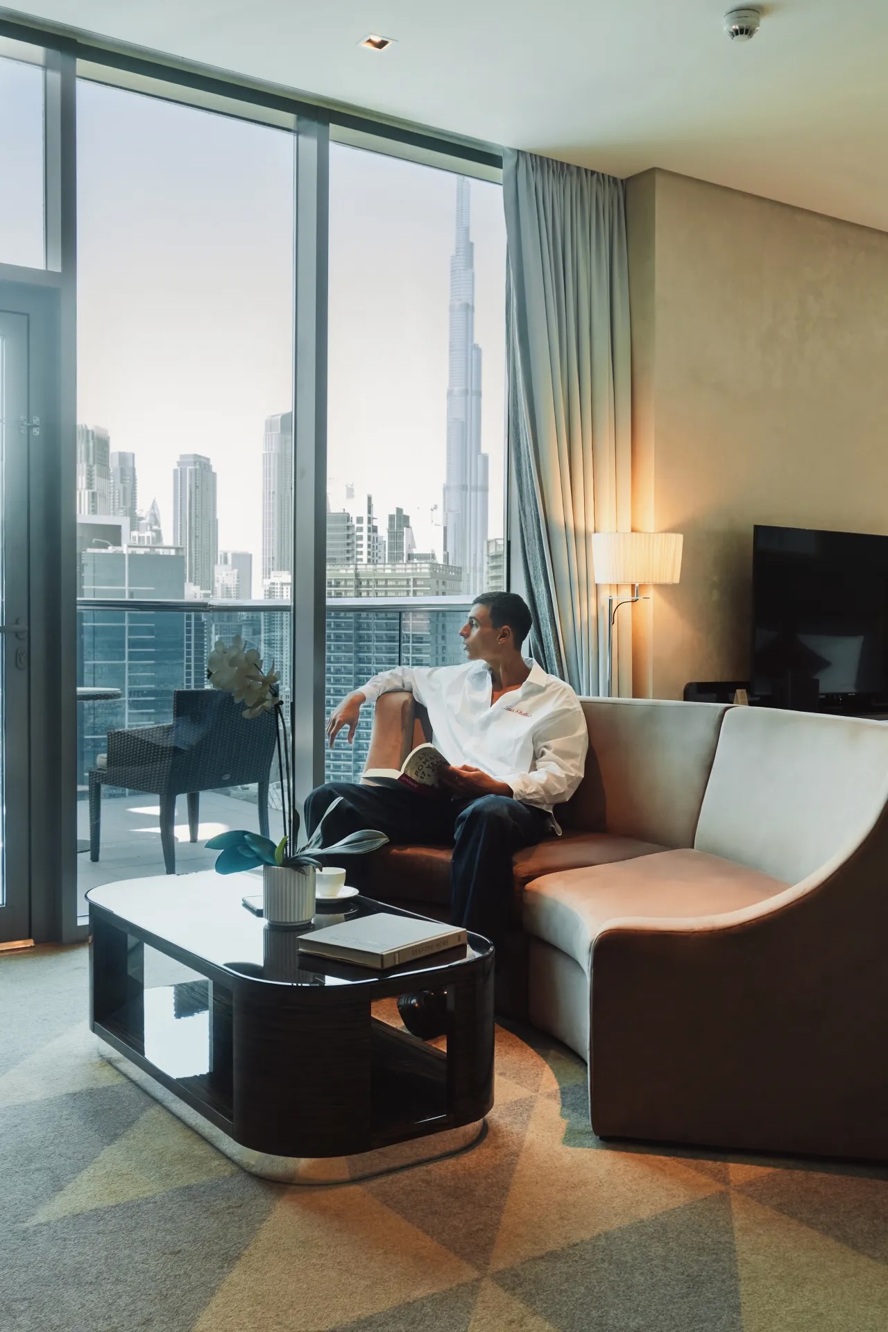
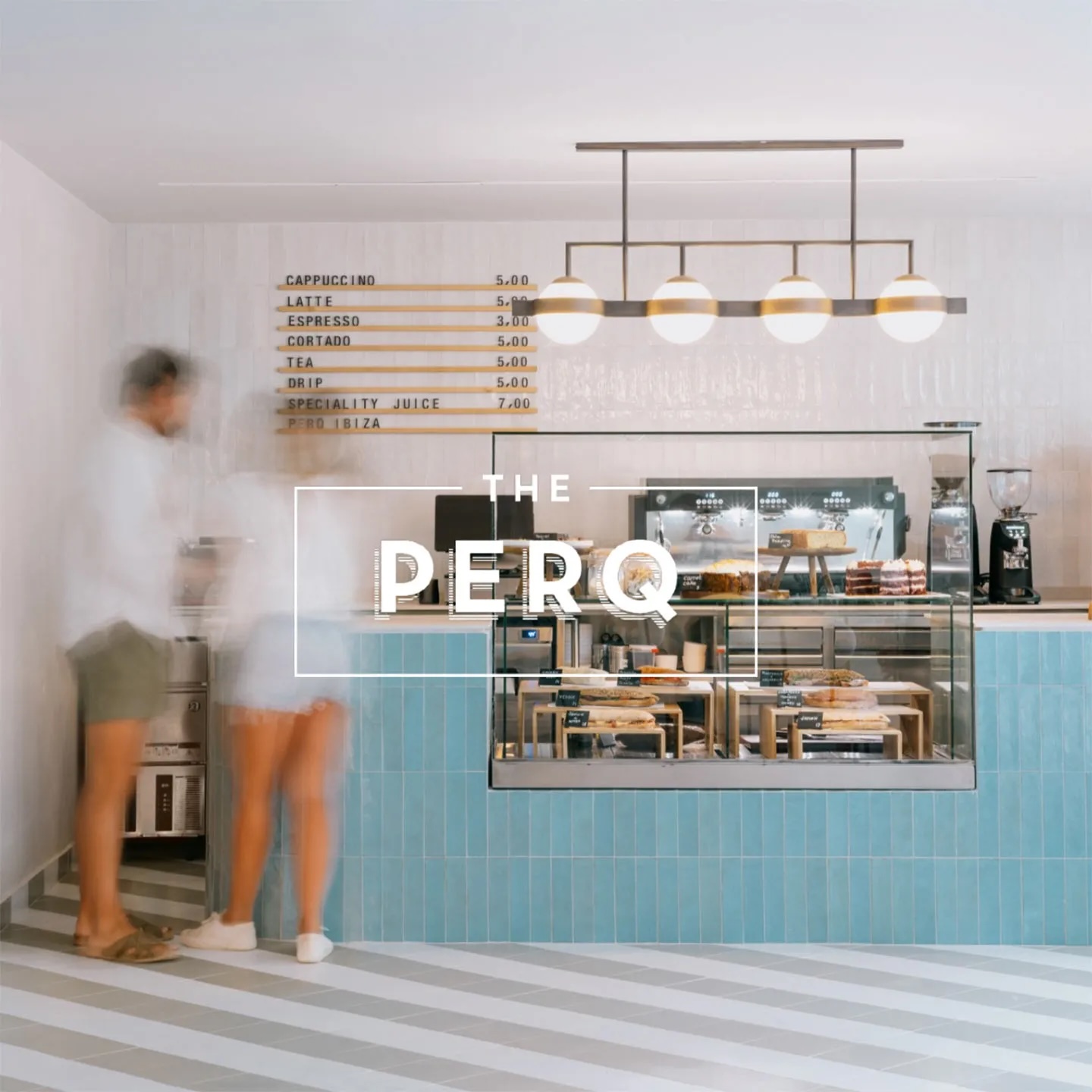
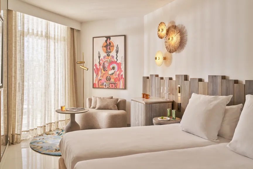
FULL WIDTH WITH PORTRAIT ONLY
( NO PAGER ON MOBILE )
This carousel have links attached to each slides, you can click on images or tab + press enter
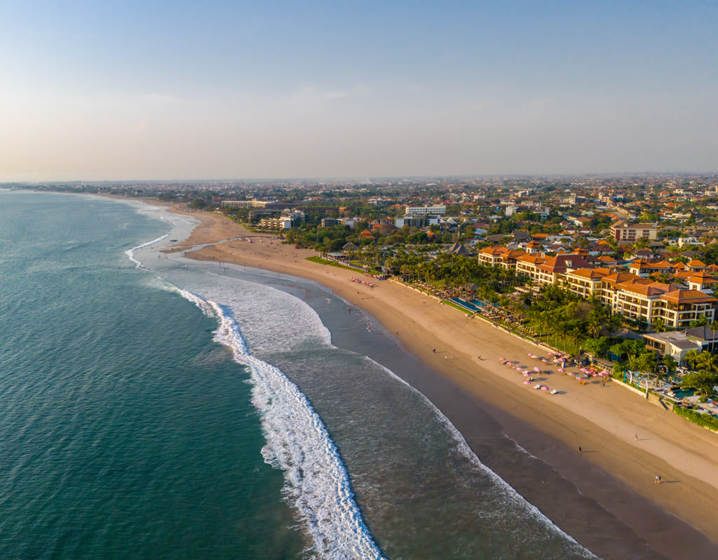
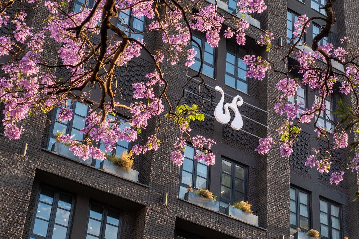
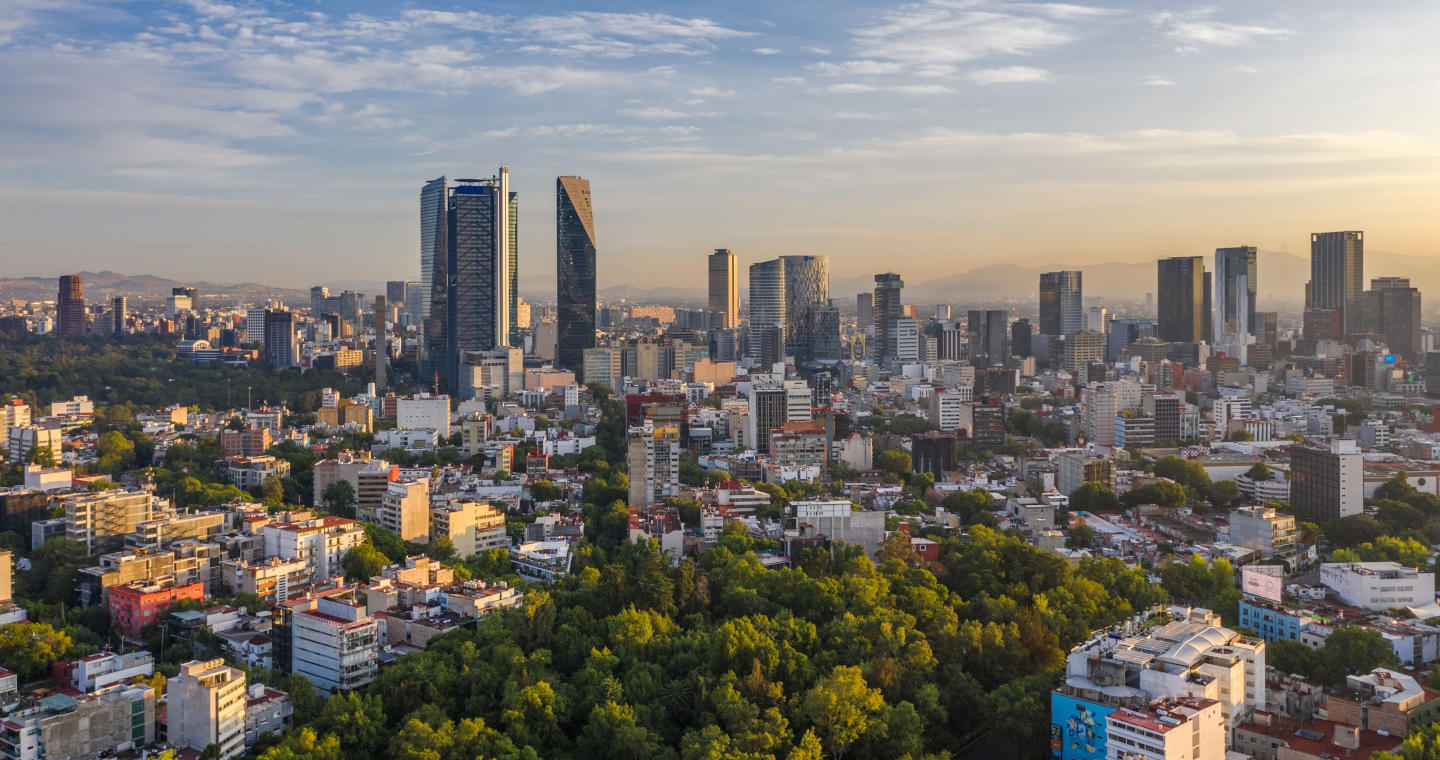
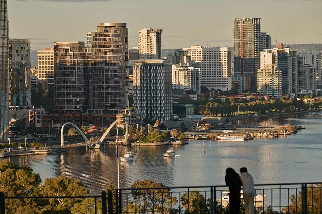
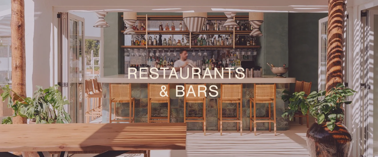
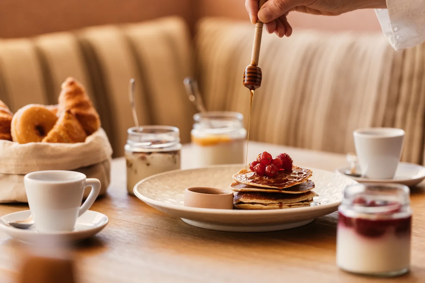
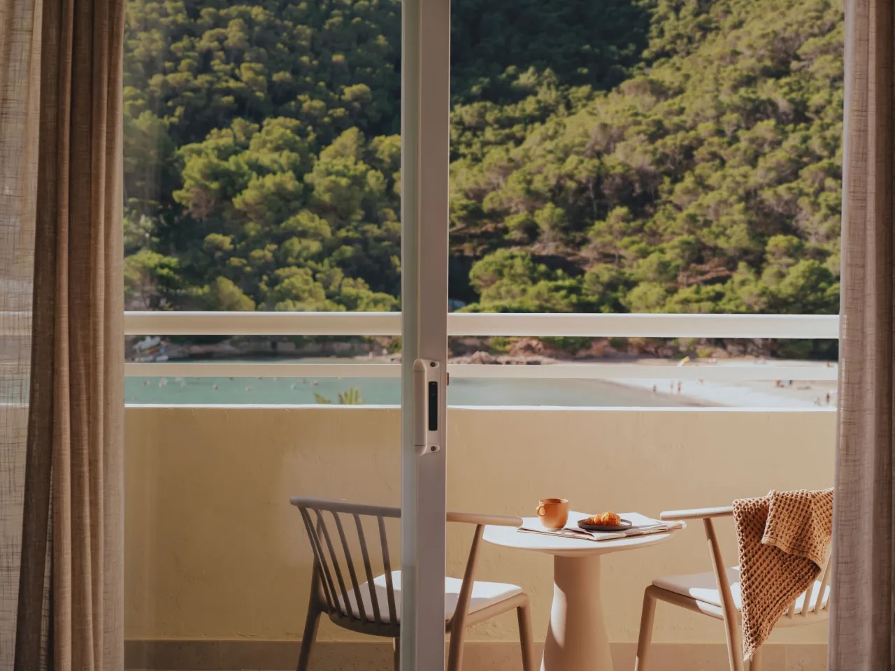
LABEL GOES HERE
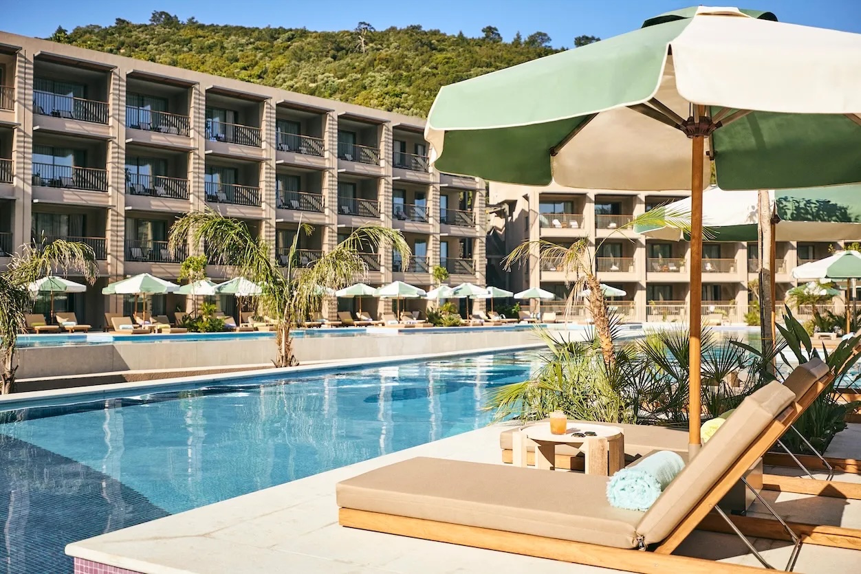
FULL WIDTH WITH LANDSCAPE ONLY
Lorem ipsum is placeholder text commonly used in the graphic, print, and publishing industries for previewing layouts and visual mockups Lorem ipsum is placeholder text commonly used in the graphic.


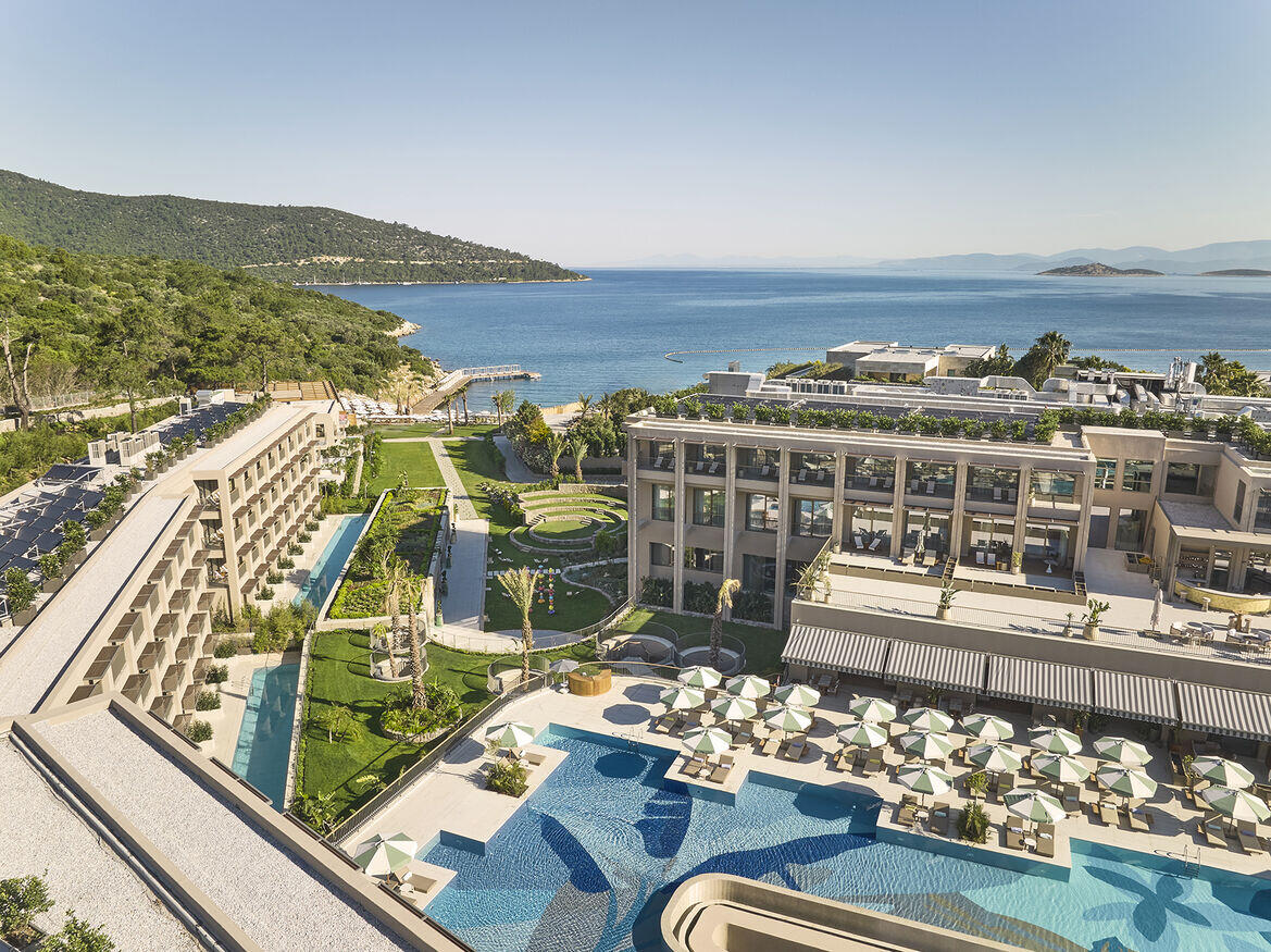
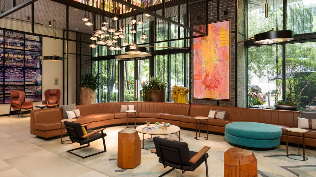
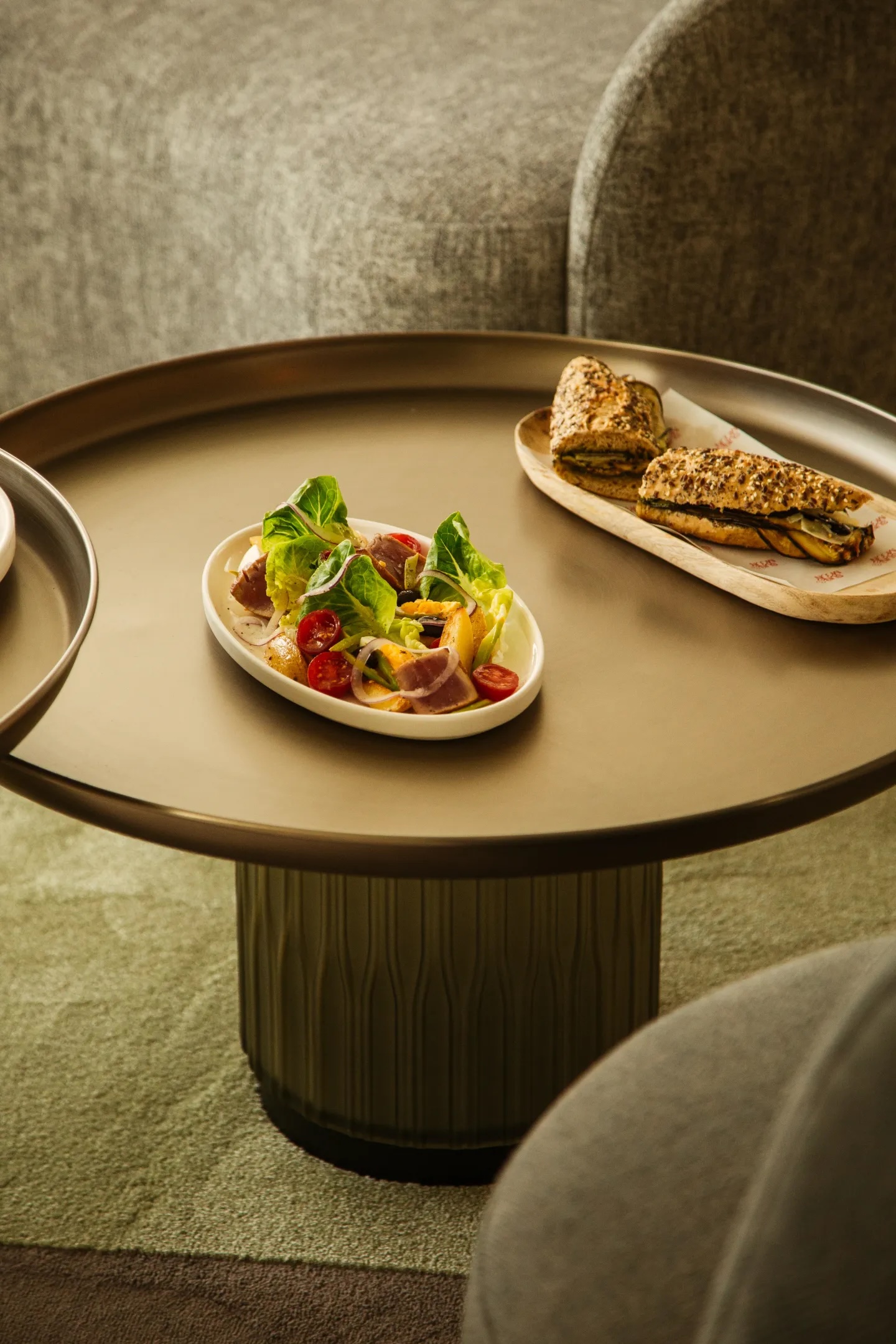
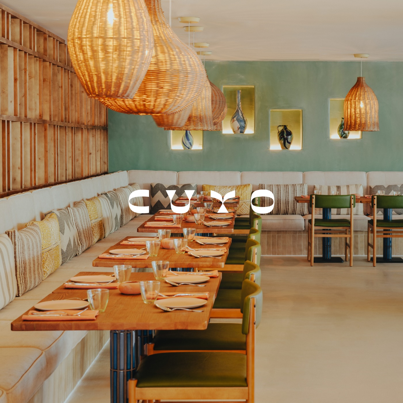
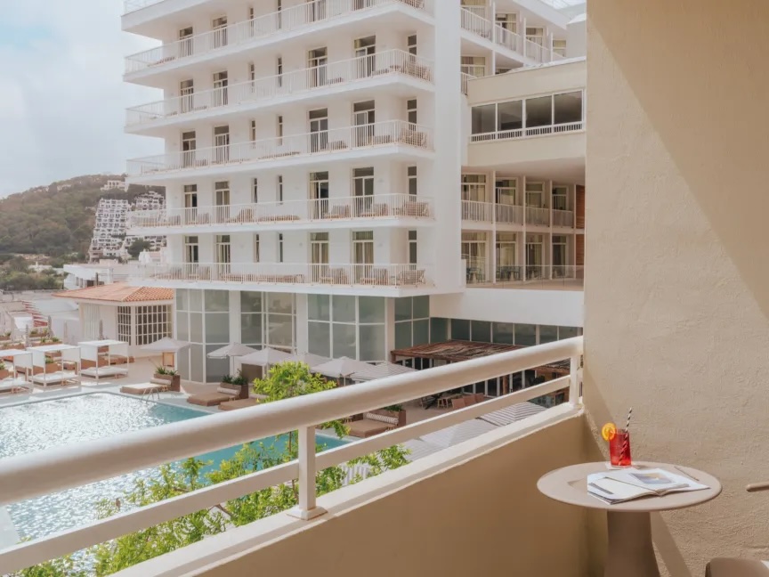
LABEL GOES HERE
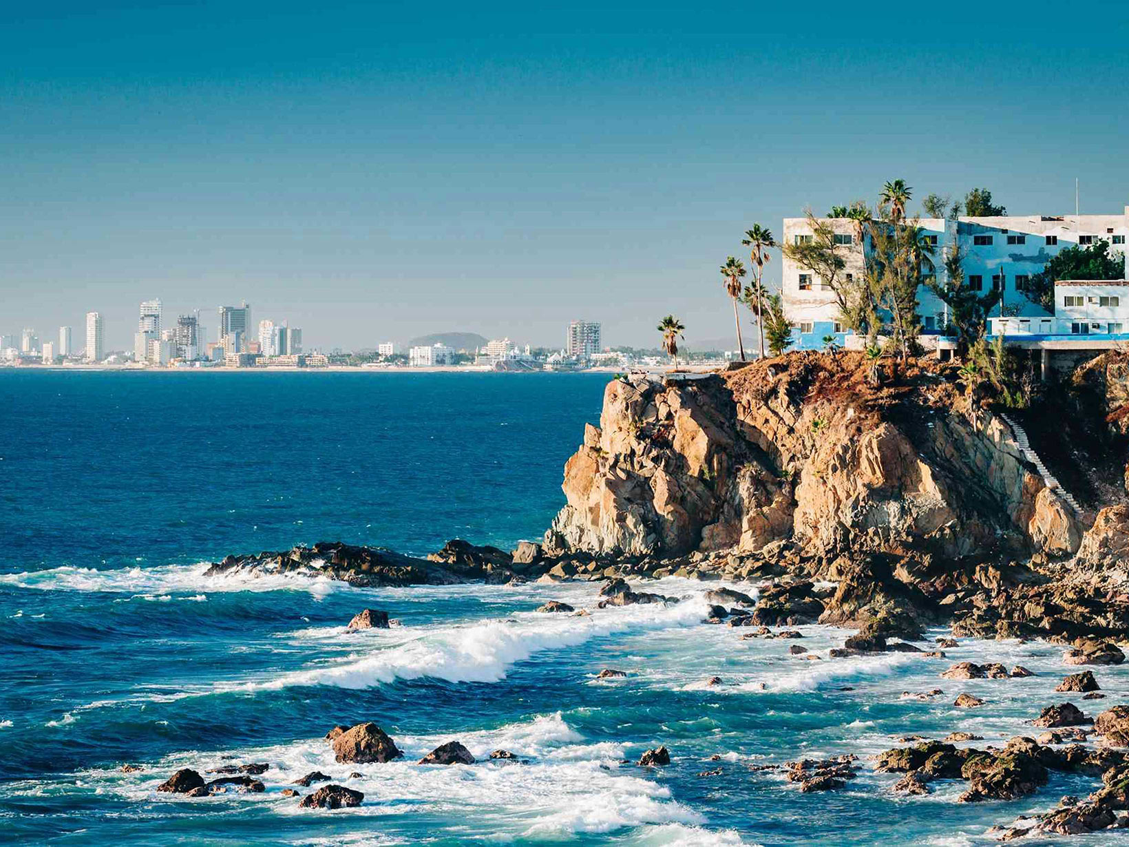
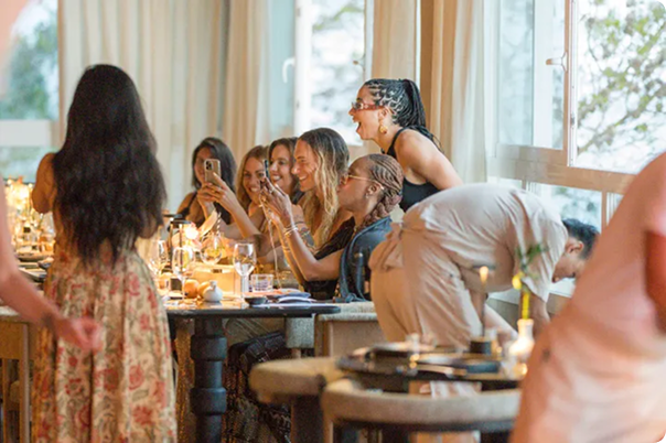
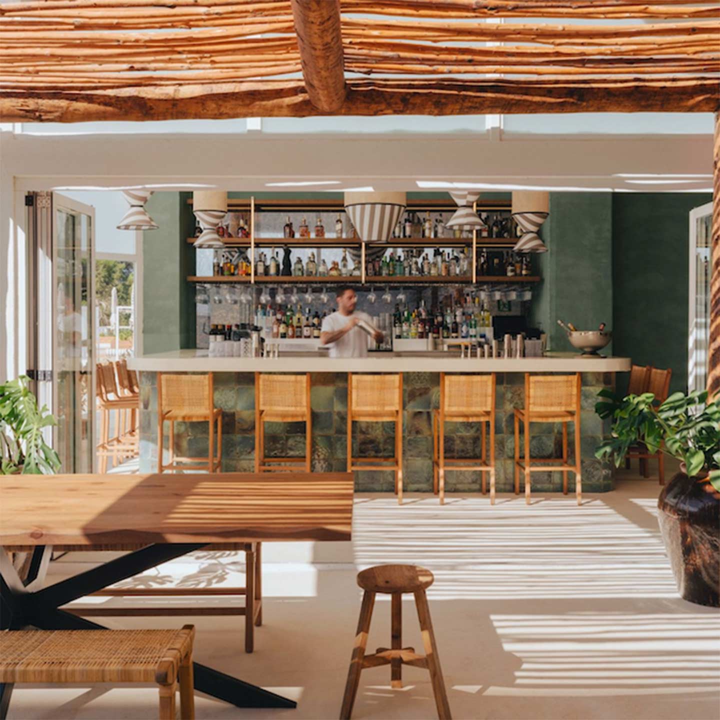
FULL WIDTH WITH MIX RATIO
Lorem ipsum is placeholder text commonly used in the graphic, print, and publishing industries for previewing layouts and visual mockups Lorem ipsum is placeholder text commonly used in the graphic.

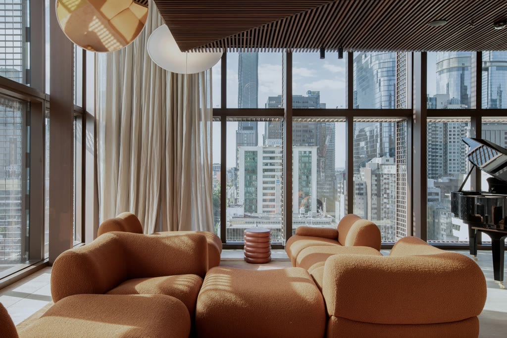
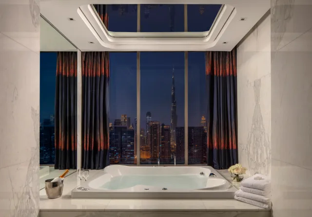
LABEL GOES HERE
FULL WIDTH WITH FEW SLIDES
Test on wide screens so you can see arrows + pager being hidden, and content should be centered
LABEL GOES HERE
COLUMN LAYOUT #1
Lorem ipsum is placeholder text commonly used in the graphic, print, and publishing industries for previewing layouts and visual mockups Lorem ipsum is placeholder text commonly used in the graphic.
LABEL GOES HERE
COLUMN LAYOUT #2
Lorem ipsum is placeholder text commonly used in the graphic, print, and publishing industries for previewing layouts and visual mockups Lorem ipsum is placeholder text commonly used in the graphic.
0. How to add the Carousel in the Editor (setup step)
- In the block editor, add the Media Carousel (Scroll-snap) block
- Choose Manual mode when prompted (Featured in only accessible when in context)
- Upload or select multiple images
- (Optional) For each image:
- – Click the link icon on the image
- – Set a URL (and target if needed)
- In the block settings panel (right sidebar):
- Enable or disable Mobile pagination
- Save / publish the page and test on the front-end
1. Visual & Layout Checks
Image orientation
Verify the carousel renders correctly in the following cases (all scenarios already built above):
- Mix of portrait and landscape images
- Landscape-only images
- Portrait-only images
Expected:
- Orientation is derived automatically from the image aspect ratio
- Slides keep a consistent height ( this is a setting in the sidebar, default : 450px )
- Layout matches Figma on desktop and mobile
2. Ordering & Content
- Images appear in the exact order set in the editor (click on “Edit images” to reorder with drag & drop)
- Reordering images in the CMS updates the front-end order
3. Desktop Behaviour
- Left / right arrows are visible on desktop
- Clicking arrows navigates between slides
- Carousel does not scroll past the first or last slide
- Wider-screen behaviour matches Figma (no arrows and centered content)
4. Mobile Behaviour
- Swipe left / right to navigate slides
- Native scroll + snap behaviour feels smooth
- Pagination 1 / n:
- Displays only on mobile
- Displays only if enabled in block settings
- Correctly reflects current slide index
5. Image Links (Manual Mode)
If image links are set in the editor:
- Clicking an image navigates to the configured URL
- Images without a link are not clickable
- Linked images behave correctly on mobile and desktop
7. Accessibility Checks
Keyboard
- Carousel controls are focusable via Tab
- Arrow buttons can be activated with Enter
- Keyboard arrows (right / left) controls the carousel
- Linked images can be activated via keyboard
Screen reader
- Content is read in logical order
- Pagination and navigation controls are announced correctly
8. Out of scope : Featured mode
Since this carousel is extending the existing “media carousel” – it can be used on any post type using featured images with “featured” mode instead of manual.
It will then pull the content from the featured images attached to the post, so this component could be use within Query Loop block or on single pages like on the examples bellow :
SINGLE OFFER PAGE ( block added at the bottom )
QUERY LOOP LISTING ( Non exisiting in Figma ) :